Showing posts with label Photoshop. Show all posts

Saturday, 28 July 2012

Alexis Marcou: Slippery Illustrator


Let’s face it: in the context of art that’s ‘cool’, a plain portrait is boring. The unfortunate reality is that there are too many other people out there who are capable of doing exactly what you can do. Something else has to be happening. 


Over the past year, I have experimented – simply through pursuing a creative 'mistake’ I once made – with geometrical lines of distorted light. Perhaps it’s a coincidence, but I’ve spotted a peculiar pattern recently with illustrators/artists (Agnes Cecille, Carne Griffiths) playing with aesthetics that replicate shattered glass, cubism and bewitching light reflections. Is there any particular reason for this trend, apart from the fact that it looks effing radical? 


And I'll tell you why this kind of style is so important today. As you’ve probably detected from my attitude towards the cretinous use of Photoshop, artists appear to be fighting back with work that defies Adobe’s determined mission to make pencils - indeed humans themselves – obsolete. Whatever you can do, I can do better.


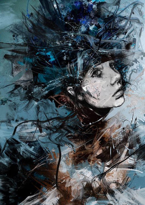
Alexis Marcou is an inspiring saviour who makes our craft still worth persevering. His work is clearly the product of blood, sweat, and a shit load of graphite. Marcou uses an intriguing juxtaposition in his work: the monochrome becomes activated by the most minimalist traces of colour, suspending his figures between frozen stasis and explosive chaos. 


My favourite piece of his has to be ‘Noire’ (first image) though I’m sure that comes as no surprise to those of you who know his work. Don’t take this the wrong way, but it’s the wet-look about the piece which gets me most – and before you whine that it’s just a quick photoshop job – head over to his Process page to be proved firmly wrong. 


Such a simple image, yet that fluidity about it delivers a selection of mysterious interpretations: Is the figure frozen in time/death? Crying in the pouring rain? Drenched in blood? Marcou’s obsession with lines renders his work with a highly contemporary and virtual feel, playful with dimensions so that his finished pieces offer multiple zones of vision. Marcou's perspectives have reached vertiginous heights with commissions already from both Nike and HP.


Marcou encourages aspiring artists, "Create your own unique style. When working for clients listen but don't compromise your style." Take note - I'm currently designing a poster for a BBC film, and throughout the entire process I've been plagued with paranoia that I'm wasting my time because I'm still creating in a way which will guarantee my own aesthetic satisfaction above anyone else's. That's not selfish, right?

I'm holding you responsible, Marcou.

Thursday, 19 July 2012

Urbane Urban: Byroglyphics


Byroglyphics. A pseudonym so incurably urban I can just taste the grit grind inside my mouth. Russ Mills, the man behind the mask, exceeds the label 'artist'. He has that kind of ungodly talent; you know, the sort that will disillusion any budding painter into depression and bring them to the sensible conclusion: Give up. Yeah, that kind. This guy is someone who actually deserves the traditionally pretentious appraisal that an artist's work "transcends" something. Because Mills does.  


The fact is, Mills is like this untouchable, fully autonomous, self-commodified brand. He has a unique aesthetic identity which you could spot a mile off in the hazy mist of teeming aerosol-wielding graffiti artists. When I discovered that his work is a fusion of fine art with photography and digital experiments, I breathed a sigh of relief: I got some solace in the reassurance that Mills was indeed human like the rest of us.


That said, it's all still bloody staggering stuff. With the nauseating reality of Photoshop appearing to take over the world as we know it, Mills has responded with a sophisticated, even elegant style that appeases the best of both worlds without totally conceding to the superficial one. His artistic skill is firmly in tact, not compromised by the "need" for, or reliance on image manipulating software; it rather functions as a polishing tool to make his finished pieces look coma-inducingly good.


On a personal note, I'm obsessed with his distorted, manic arrangement (do I spy an oxymoron?) of lines in his portraits. At first sight you may wonder whether this is just a quick mishmash of paint, but look closer and these are expertly handled, beautifully explosive "painting disasters", to quote Mills himself - the kind of 'good accidents' we crave as artists.


The trick with Mills is that his work alludes to many elements: not just fine art, but photography, illustration, graphic art, promotion, and beyond. Mills has a colossal army of followers, and it's no surprise why. He's got it all: purity of skill and digital capabiltiies that would make him thrive in pretty much any creative environment - not that I can see him working for Saatchi & Saatchi any time soon.

Mills is currently selling a bunch of signed Summer Salts prints on his website, at prices so reasonable I might actually be able to fork out the cheddar for one. 

Time to watch some Photoshop tutorials.


Tuesday, 3 July 2012

Tom French Fine Art


Thus far my experience as an artist has taught me that it can be a pretty enduring process trying to create a successful portrait which is designed purely in black and white. If you've taken a look at my own work, you'll notice that my use of high contrast often features a nice splash of colour to create some compositional balance - whatever that means. So I'm pretty green with envy when I double take at fine artist Tom French whose illusory work seems to be created exclusively from a monochromatic palette:


How do you stave off boredom when working with just two colours? I don't suppose John Virtue ever asked himself that question, but...French is interesting because he's almost like an updated and modernised version of old traditional methods with his contemporary urban realism. If you've read my previous posts, you'll already be sick of hearing that I like art that plays with opposites, contrasts, juxtapositions, contradictions, paradoxes, oxymorons...Well, here's a new one: French handles a duality between the beautiful and the sinister which is in perfect equilibrium:


French studies exuberant relationships which by their very intimate gestures momentarily conjure the ultimate symbol of mortality: a human skull. But what do you see first? French's work is reminiscent of those online optical illusion games you played as a kid. But since his images are not a series of fleeting brain-bashers but permanent works of art, his illusions don't dispel. They stick, creating this eerie fixation between the living dead and the dead living: the embraced figures at once seem alive and amorous, yet the surrealist effect of the skeleton creeping through renders them ghostly and ethereal, causing the skull itself to become humanised.


It's an odd transformative effect for the viewer. For me, French isn't necessarily taking us on a painfully predictable "Oh look - it's a pretty picture but on closer inspection it's so much darker than that" journey. The 'pretty to dark' element is interchangeable: death can become life as much as life can become death. So I suppose the question it asks of you is quite simply, 'Life or Death?' In any case, French's art naturally revives ideas that life and death are closer than we think, that death is inevitable.  But since the two are so well 'balanced', there's also always a sense of rejoice in that these pieces can celebrate the value of life and togetherness in the morbid face of loss.


French's reality-bending aesthetic was recently picked up for the new custom artwork on the Donnie Darko soundtrack release. The result is wicked - it's seriously encouraging to see great young talent being recognised for large scale projects like this. 

We don't need to rely on Photoshop for everything.