Sunday 26 August 2012

Recession Rebellion: Illustrating the Fashion Industry


The fashion industry is in crisis. Groundbreaking revelation? No, because it always has been. We just don’t see what lurks beneath the beautiful veneer of an exquisite garment flourishing on a catwalk blinded by camera flashes and pretentious celebrities. We don’t see the crushing ballast threatening the very heartbeat of the designer’s creativity. As a label becomes more successful, it becomes greedier – whilst the smaller designers clasp to even remain buoyant on the restless tide of a mercurial and fickle fashion climate. Ultimately, most companies will sink, whilst some of the higher fliers inevitably buckle under the drudging demands to deliver season after season (the recent disgrace of one leading designer and the tragic death of another is perhaps still an open wound in our minds here).


A pretty bleak outlook on the industry. Do you have the will to read on? If I were to paint a picture depicting the state of the industry, it would be a dripping black canvas, or perhaps if I was feeling a little creative, an illustration of one of Riccardo Tisci’s Givenchy Rottweilers choking on a fistful of banknotes shoved through its gnashing jaws. At least it’d be honest. Because it is honesty which is becoming scarce to find in a time where designers are really feeling the pinch of the moneymen. Ultimately, it is they who make final decisions – increasingly forcing designers into banal submission of those who hold the cash at the expense of their integrity. The excruciating reality is that financiers do not understand – nor do they care – about the ‘art’ of fashion.


Whilst the buyers may be laughing, the creatives are dying inside: any passionate designer who obsesses over their craft is at their core a tortured artist, with surprisingly little concern for the financial rewards. I, like many designers I have spoken with, will tell you that they design not for ‘the consumer’ but for themselves – as it should be. So the minute a creative is forced to churn out something for sake of the next dollar, there’s a dishonesty and discredit there. He has, against sheer and unrelenting brute force, surrendered to the probing corruption of the businessman. Alas, honesty comes under intolerable strain.

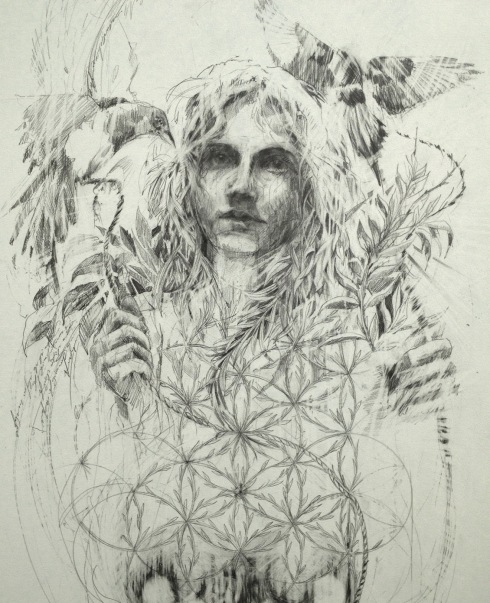
But SS13 is set to offer us at least a few saviours who shine as both rebellious, reckless revolutionaries and positive pioneers, ferociously committed to the truth of their artistic philosophies in the sorry face of the industry. They illustrate a fresh and brutal ‘all’s-not-lost’ attitude that truly quenches an arid thirst for something redemptive. The first is Boris Bidjan Saberi – a designer who’s very name sounds like a nomadic ninja from the cavernous depths of a future sent back through time to rescue us from a moral/financial recession. Saberi is known for his unmistakably brutal grunge; his hard-edged, raw aesthetics and so-called “dark hip-hop”. 


His extreme manipulation of fabrics ventures into the realm of the haunting unknown and to the point of chemical experimentation. Saberi is more than a clothes designer: he evokes a mood, a narrative, an atmosphere inspired by real life crises and thoughtful reactions to the world around him. Just a glance at his clothes tells you he has zero intention of abiding to any imaginary “rules” prescribed by the pressure to “make figures”. It’s admirable, intimidating, and necessarily confrontational. Saberi owns the space. Owns his collection. Extreme plunging drapes and oversized mesh hoods and masks articulate this attitude that refuses to be compromised. 


For SS13, Saberi retains his monochromatic palette but brings us for the first time a more structured and polished collection, featuring a marriage between extreme tailoring and highly adventurous sportswear. If his previous collections were a bunch of teenage outlaws, SS13 is a matured crew of veteran gangsters, glued together and ready to resist as a community not divided by the invasion of the moneymen. There’s an understated, minimalist thread going through SS13 which keeps a sophisticated angst bubbling beneath the surface – but it’s still there: not to be messed with. 


Most memorable for me is the tight tailoring with discrete slit vents on the jacket blazers which hark back to Saberi’s deconstructive style without being too showy. In addition, the new angular waistcoats created a superb, futuristic silhouette around the architecture of the male form. Also striking were the paneled asymmetric shirt collars, and the pure all-white looks were a jarring shock to the system: “purity” is perhaps the last word with which we’d be accustomed to describe Saberi’s aesthetic. Sort of like a schizophrenic clash between the Black and White Swan.


Next, Aitor Throup. Now here's someone who diverges between the role of commercial designer and that of artist, imprinting his unique social comment on the identity of the industry in the most visceral and 3-dimensional way. Saberi’s nomadic style has always been conjured by mesh layering and other transparent fabrics, creating a strong, cocooning sense of protection – but Throup takes that a step further with intriguing concepts of body armour and physical encasing.


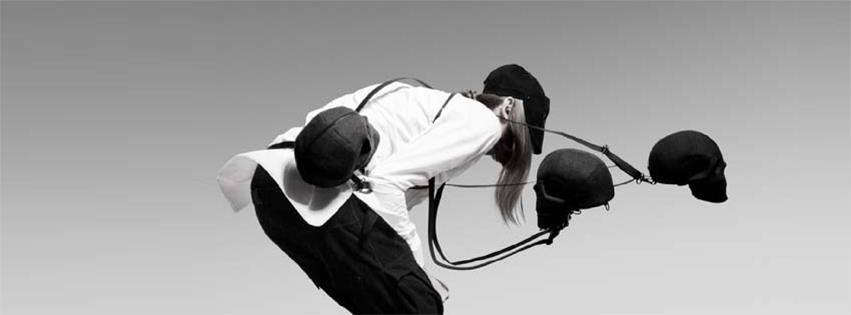
The London SS13 collection saw an eerie set of highly dense, scrunched up wire mannequins suspended from the ceiling, in addition to these oddly playful, accessorised skulls, candidly slung over the shoulders of mannequins like trophies from Predator’s latest killing spree. Interestingly, it was reminiscent of Saberi’s SS09 disturbing collection which featured white-clad models suspended from the ceiling by chains. Sounds like I’m trying to promote some kind of sadistic suicide couture.


Like Saberi, Throup is an artist – attempting at once to capture the psyche of the modern man. He inhabits an intense, utterly opposing world that would have financiers so groggy with confusion and incomprehension that the only option would be to let the man continue doing his own thing. His signature anatomy trousers absolutely propel Throup beyond the exhausted parameters of fashion trends, with a clear respect for the human body and it’s meticulous formation. 


There’s an anthropomorphism to his drawings, too, with irresistible sniffs of Giger present in his manipulation of the human form through a highly conceptual and deformative - but also reconstructive, lens. It’s like he’s remoulding the overused silhouette, whilst also attuning himself to the anxiety of the industry’s pangs – of which there are many.


Throup is by far one of the most important breakthroughs of the year, deriving his demand – like Saberi – from his mysteriousness – the kind that has made an international success of Hussein Chalayan despite flickering on and off the radar. That sense of the unknown and the unpredictable – relevant both in the collection’s aesthetic but more intriguingly in the uncertainty between the artist’s presence and absence – is what restores the designer’s integrity and in turn the market’s hunger for more.

Friday 17 August 2012

Ryan Hewett Painter: Screaming for Freedom


With Antony Micallef as probably one of the most potent influences on my own artwork, I seem to gravitate to other artists in whom I detect traces of the man himself, like a damaging but intoxicatingly good smell. But before you attempt to have my career as an arts writer shut down, I am not insinuating that painter Ryan Hewett lacks his own aesthetic identity: Micallef conjures scenes of chaos, but Hewett injects the distorted, dehumanised style into portraits of poise. What makes his heads so engaging is their contained ordinariness and child-like innocence hemmed in behind tragic and hell-raising realities.


For me, Bio [above] is without question his most powerful piece. I can't stop looking at it. There's a raw tension between these apparently natural photographic poses and the rather unnatural deformation of them through striking and potentially destructive marks. I've always imagined Hewett's figures as brutalised war victims. But this notion goes beyond the physical: his figures are us, everyone, enduring some crushing emotional strife, drowned by a history of repression and, thanks to Hewett's art, they are finally screaming out to be heard.


Hewett employs highly painterly techniques, so much so that his process pieces are equally if not more intriguing to look at than the finished product: 


There's a very real sense of human identity in crisis here. Hewett plays with the depth of his surfaces, subduing an eye here or a lip there, whilst letting other features bleed through so that we are confronted with 1000 yard stares; vacant yet deeply soulful expressions which wrench at your heart. 


For me, Hewett is illustrating a violent, progressive onslaught on our generation, with deeply vulnerable and defenceless individuals barely able to resist and stay afloat. Identity, innocence, youth, beauty - something is being erased in the process, and it does not portend a prosperous future. Who are the culprits? I'm gonna go ahead and say The Only Way Is Essex, Geordie Shore, BigBrother, Jedward - those fuckers, just because they successfully demonstrate everything that's wrong with our society today. Consequently, through no fault of its own, the aspiring youth is reduced to a monstrous, rotten and unidentifiable core.


Depressive cynicism aside, this guy is seriously talented. Before Hewett discovered oils, he was accustomed to tight pencil drawing. His draftsmanship is still evident in his work, but you can feel how much he enjoys the liberation of free and experimental brush strokes. Everything about Hewett seems to be a narrative of liberation, of freedom: breaking out of incarcerating strictures, the struggle for release. The struggle to breathe.


Friday 10 August 2012

Unconditional AW12/13: White Hot Winter


Now here’s a label which, for the best part of 5 years, has caused me a clinical addiction and financial/moral bankruptcy. Thanks to Creative Director Philip Stephens, one of the leading fashion gurus of androgyny, Unconditional returns this Fall with a collection that will make my bank statement Unforgivable. 

Stephens is a master of pitch-perfect balance: his hard-edged masculine attitude is always tempered with a daring yet delicate femininity; his formal tailoring humoured by exaggerated, emotional sportwear. Stephens doesn't discriminate: placing his philosophy on luxury basics, he disguises the 'fashion' of his garments, making the wearer feel accepted; understated yet stinking of seductive elegance. 


 For AW12, photographer Dimitris Theocharis shoots bold, electric looks against a pure white backdrop. Yes, for Autumn Winter. At first glance it's hard to imagine this isn't the lookbook for next summer - especially since the previous Spring collection defined itself by a sunburst of acid colour.


But Stephens has never been one to shy away from subverting the norm. It’s an unsually refreshing take on the catastrophic winter weather we've suffered all summer in the UK. Another traditionally dark and haunting Autumn Winter collection may have been too painful a reminder of our hellish climate. Stephens forecasts a brighter trend.


AW12 transitions seamlessly from an acid summer but is now lightly frosted over with an icier palette: pale greys, cool blues and harsh silvers punctuate this collection. It's as if Stephens retains the alienation of winter but with a mysteriously warm approachability.  Not surprisingly, he pulls off the unlikely juxtaposition. 


Next: the new outerwear. Unconditional has always prided itself on exquisite cuts but for me, this is where the label triumphs for AW12. Stephens appears to have written an Edwardian-inspired sub-plot, featuring coats with what appear to be concealed and layered lapels...I want to say 'triple-breasted' but unless I can get that trending I risk sounding like someone who shouldn't be blogging about fashion.  

In one look [see first image] a cropped period-style jacket has been teamed with a pair of extreme drop-crotched harem trousers. I'm not usually a fan of hammer pants, but here the contrast between the sharp, angular dimensions of the top half and the slouched fit of the bottom strikes a magnetic discord in the silhouette, a typical illustration of Stephens' playful aesthetic. Cavalier Couture springs to mind.


Stephens has also taken the trend of animal print a step further this season with printed leopard cashmeres. He is clearly so passionate about the creatures which inspire him that he wishes to metamorphose his customers for the fall into fully fledged fashion Ocelots. There's a real sense of returning to nature here, solidifying Stephens’ concrete ethos of naturally and ethically produced fabrics. 


There’s a purity -  a cleanness about the rock’n’roll thread; last AW saw a grittier, more gothic narrative but here Stephens seeks to bridge the gap between the two seasons, as if to echo the ambiguous indistinction throughout the British weather. The organic aesthetic is mixed with more alchemic elements including Baroque-inspired floral prints and gold and silver panelling. Interesting. 


Much of the outerwear and tailoring also features Ostrich appliques to the shoulders, looking particularly strong on the label's cutaway jacket which crops up in a handful of looks. The minimalist, effortlessly cool tailoring piece with notch lapels and a cut-out back has become a staple for the brand, deriving most of its swag from the fact that almost a third of it is missing despite a pretty sizeable price tag. Kill me for saying this, but it's worth it...


As ever, bondage pants, oversized hoods and funnel necks permeate the collection. Punk model of the moment Leebo Freeman returns without his peroxide bangs offering looks which tip between jesting devilishness and hard sophistication. One of my favourite looks of the collection has to be the double feather print - simply for its rebellious out-of-placeness. 

Time to prepare for a personal recession.


Sunday 5 August 2012

Carne Griffiths: Tea-Bagging Illustrator


Following on from Alexis Marcou’s intriguing manipulation of light and glass effects, it would seem rude to not also acknowledge the work of Carne Griffiths, an artist whose experiments with drawing textures are equally mind-blowing. Now, having read a plethora of articles on Carne, I’ve spotted an impressive string of reviews, all of which rather remarkably resemble one another - save for an oh-so-smart rephrasing of about three words. Sort of like casual plagiarism. 

 Don’t have it, Carne. 

You have the sort of talent that deserves – no, demands, better. So I’m going to have a go at actually considering your work and hopefully deliver something insightful and fresh to think about. 


Carne is interesting because he intersects traditional themes of nature and floral aesthetics with harsher and more graphic techniques. I mean, you can't get much starker than flowers overlaid with shards of shattered glass, can you? 


I’m going to avoid a predictable interpretation here and explore one which I assure you manifests from a clean state of mind. For me, Carne's work exudes an air of sexual fertility and fecundity, sexual devouring; innocence intertwined with a boundless and liberated sexual violence. Like each work presents a new femme fatale. Perhaps what we’re feasting our eyes on here are suspicious heroines from an existent Garden of Eden?


By delicately dealing with Nature's thornier side, Carne unconsciously rips us out from the realm of watercolour landscapes as we know it and in turn subverts the traditional worship of nature's benevolence in art. Carne reminds us of mother nature’s equally deceptive and nightmarish qualities, in order to show [cue circa GCSE analysis] man’s relative insignificance and powerlessness.


Carne achieves the distinction by using a base layer of sepia-toned tea bleaching techniques, over which he articulates and exploits compartmentalised layers of striking and unexpected colour. Carne then adopts a technique which I, coincidentally, have been exploring for the past year in my own work. Carne modifies the mercurial and chaotic behaviour of the bleach splats with repetitions of abstract and structured geometric lines:


The uncontrollable nature of the bleach injects a level of risk into each piece which is what stops Carne's work ever falling stale, tipping each work in the tense balance between success and disastrous failure. As such there is a strong sense of abandon and escapism here, free from the restraints of traditional compositions, leading both the artist and viewer on a journey to an unknowable destination. The thrill lies in the process, not the result.


That said, the results are still bloody exquisite, producing highly seductive textures which can only truly be flirted with at close proximity:


Interestingly, I originally discovered Carne as a featured illustrator whilst stumbling through Rankin's new bi-annual, Hunger Magazine. It just goes to show the kind of versatile appeal Carne's work has to offer. I could quite easily imagine these illustrations as prints for graphic tees.

Oh wait...


It's no surprise Hunger wanted him. Carne's fashion attraction is clear, with clothing label Twinne having picking up his designs for a new series of printed tees. Carne's solo show, 'Fragments', will be showing at Ink'd Gallery in September.

Time to put the kettle on.