Showing posts with label design. Show all posts

Sunday, 26 August 2012

Recession Rebellion: Illustrating the Fashion Industry


The fashion industry is in crisis. Groundbreaking revelation? No, because it always has been. We just don’t see what lurks beneath the beautiful veneer of an exquisite garment flourishing on a catwalk blinded by camera flashes and pretentious celebrities. We don’t see the crushing ballast threatening the very heartbeat of the designer’s creativity. As a label becomes more successful, it becomes greedier – whilst the smaller designers clasp to even remain buoyant on the restless tide of a mercurial and fickle fashion climate. Ultimately, most companies will sink, whilst some of the higher fliers inevitably buckle under the drudging demands to deliver season after season (the recent disgrace of one leading designer and the tragic death of another is perhaps still an open wound in our minds here).


A pretty bleak outlook on the industry. Do you have the will to read on? If I were to paint a picture depicting the state of the industry, it would be a dripping black canvas, or perhaps if I was feeling a little creative, an illustration of one of Riccardo Tisci’s Givenchy Rottweilers choking on a fistful of banknotes shoved through its gnashing jaws. At least it’d be honest. Because it is honesty which is becoming scarce to find in a time where designers are really feeling the pinch of the moneymen. Ultimately, it is they who make final decisions – increasingly forcing designers into banal submission of those who hold the cash at the expense of their integrity. The excruciating reality is that financiers do not understand – nor do they care – about the ‘art’ of fashion.


Whilst the buyers may be laughing, the creatives are dying inside: any passionate designer who obsesses over their craft is at their core a tortured artist, with surprisingly little concern for the financial rewards. I, like many designers I have spoken with, will tell you that they design not for ‘the consumer’ but for themselves – as it should be. So the minute a creative is forced to churn out something for sake of the next dollar, there’s a dishonesty and discredit there. He has, against sheer and unrelenting brute force, surrendered to the probing corruption of the businessman. Alas, honesty comes under intolerable strain.

But SS13 is set to offer us at least a few saviours who shine as both rebellious, reckless revolutionaries and positive pioneers, ferociously committed to the truth of their artistic philosophies in the sorry face of the industry. They illustrate a fresh and brutal ‘all’s-not-lost’ attitude that truly quenches an arid thirst for something redemptive. The first is Boris Bidjan Saberi – a designer who’s very name sounds like a nomadic ninja from the cavernous depths of a future sent back through time to rescue us from a moral/financial recession. Saberi is known for his unmistakably brutal grunge; his hard-edged, raw aesthetics and so-called “dark hip-hop”. 


His extreme manipulation of fabrics ventures into the realm of the haunting unknown and to the point of chemical experimentation. Saberi is more than a clothes designer: he evokes a mood, a narrative, an atmosphere inspired by real life crises and thoughtful reactions to the world around him. Just a glance at his clothes tells you he has zero intention of abiding to any imaginary “rules” prescribed by the pressure to “make figures”. It’s admirable, intimidating, and necessarily confrontational. Saberi owns the space. Owns his collection. Extreme plunging drapes and oversized mesh hoods and masks articulate this attitude that refuses to be compromised. 


For SS13, Saberi retains his monochromatic palette but brings us for the first time a more structured and polished collection, featuring a marriage between extreme tailoring and highly adventurous sportswear. If his previous collections were a bunch of teenage outlaws, SS13 is a matured crew of veteran gangsters, glued together and ready to resist as a community not divided by the invasion of the moneymen. There’s an understated, minimalist thread going through SS13 which keeps a sophisticated angst bubbling beneath the surface – but it’s still there: not to be messed with. 


Most memorable for me is the tight tailoring with discrete slit vents on the jacket blazers which hark back to Saberi’s deconstructive style without being too showy. In addition, the new angular waistcoats created a superb, futuristic silhouette around the architecture of the male form. Also striking were the paneled asymmetric shirt collars, and the pure all-white looks were a jarring shock to the system: “purity” is perhaps the last word with which we’d be accustomed to describe Saberi’s aesthetic. Sort of like a schizophrenic clash between the Black and White Swan.


Next, Aitor Throup. Now here's someone who diverges between the role of commercial designer and that of artist, imprinting his unique social comment on the identity of the industry in the most visceral and 3-dimensional way. Saberi’s nomadic style has always been conjured by mesh layering and other transparent fabrics, creating a strong, cocooning sense of protection – but Throup takes that a step further with intriguing concepts of body armour and physical encasing.


The London SS13 collection saw an eerie set of highly dense, scrunched up wire mannequins suspended from the ceiling, in addition to these oddly playful, accessorised skulls, candidly slung over the shoulders of mannequins like trophies from Predator’s latest killing spree. Interestingly, it was reminiscent of Saberi’s SS09 disturbing collection which featured white-clad models suspended from the ceiling by chains. Sounds like I’m trying to promote some kind of sadistic suicide couture.
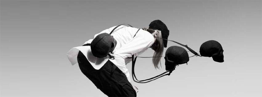

Like Saberi, Throup is an artist – attempting at once to capture the psyche of the modern man. He inhabits an intense, utterly opposing world that would have financiers so groggy with confusion and incomprehension that the only option would be to let the man continue doing his own thing. His signature anatomy trousers absolutely propel Throup beyond the exhausted parameters of fashion trends, with a clear respect for the human body and it’s meticulous formation. 


There’s an anthropomorphism to his drawings, too, with irresistible sniffs of Giger present in his manipulation of the human form through a highly conceptual and deformative - but also reconstructive, lens. It’s like he’s remoulding the overused silhouette, whilst also attuning himself to the anxiety of the industry’s pangs – of which there are many.


Throup is by far one of the most important breakthroughs of the year, deriving his demand – like Saberi – from his mysteriousness – the kind that has made an international success of Hussein Chalayan despite flickering on and off the radar. That sense of the unknown and the unpredictable – relevant both in the collection’s aesthetic but more intriguingly in the uncertainty between the artist’s presence and absence – is what restores the designer’s integrity and in turn the market’s hunger for more.

Sunday, 5 August 2012

Carne Griffiths: Tea-Bagging Illustrator


Following on from Alexis Marcou’s intriguing manipulation of light and glass effects, it would seem rude to not also acknowledge the work of Carne Griffiths, an artist whose experiments with drawing textures are equally mind-blowing. Now, having read a plethora of articles on Carne, I’ve spotted an impressive string of reviews, all of which rather remarkably resemble one another - save for an oh-so-smart rephrasing of about three words. Sort of like casual plagiarism. 

 Don’t have it, Carne. 

You have the sort of talent that deserves – no, demands, better. So I’m going to have a go at actually considering your work and hopefully deliver something insightful and fresh to think about. 


Carne is interesting because he intersects traditional themes of nature and floral aesthetics with harsher and more graphic techniques. I mean, you can't get much starker than flowers overlaid with shards of shattered glass, can you? 


I’m going to avoid a predictable interpretation here and explore one which I assure you manifests from a clean state of mind. For me, Carne's work exudes an air of sexual fertility and fecundity, sexual devouring; innocence intertwined with a boundless and liberated sexual violence. Like each work presents a new femme fatale. Perhaps what we’re feasting our eyes on here are suspicious heroines from an existent Garden of Eden?


By delicately dealing with Nature's thornier side, Carne unconsciously rips us out from the realm of watercolour landscapes as we know it and in turn subverts the traditional worship of nature's benevolence in art. Carne reminds us of mother nature’s equally deceptive and nightmarish qualities, in order to show [cue circa GCSE analysis] man’s relative insignificance and powerlessness.


Carne achieves the distinction by using a base layer of sepia-toned tea bleaching techniques, over which he articulates and exploits compartmentalised layers of striking and unexpected colour. Carne then adopts a technique which I, coincidentally, have been exploring for the past year in my own work. Carne modifies the mercurial and chaotic behaviour of the bleach splats with repetitions of abstract and structured geometric lines:


The uncontrollable nature of the bleach injects a level of risk into each piece which is what stops Carne's work ever falling stale, tipping each work in the tense balance between success and disastrous failure. As such there is a strong sense of abandon and escapism here, free from the restraints of traditional compositions, leading both the artist and viewer on a journey to an unknowable destination. The thrill lies in the process, not the result.


That said, the results are still bloody exquisite, producing highly seductive textures which can only truly be flirted with at close proximity:


Interestingly, I originally discovered Carne as a featured illustrator whilst stumbling through Rankin's new bi-annual, Hunger Magazine. It just goes to show the kind of versatile appeal Carne's work has to offer. I could quite easily imagine these illustrations as prints for graphic tees.

Oh wait...


It's no surprise Hunger wanted him. Carne's fashion attraction is clear, with clothing label Twinne having picking up his designs for a new series of printed tees. Carne's solo show, 'Fragments', will be showing at Ink'd Gallery in September.

Time to put the kettle on.

Saturday, 28 July 2012

Alexis Marcou: Slippery Illustrator


Let’s face it: in the context of art that’s ‘cool’, a plain portrait is boring. The unfortunate reality is that there are too many other people out there who are capable of doing exactly what you can do. Something else has to be happening. 


Over the past year, I have experimented – simply through pursuing a creative 'mistake’ I once made – with geometrical lines of distorted light. Perhaps it’s a coincidence, but I’ve spotted a peculiar pattern recently with illustrators/artists (Agnes Cecille, Carne Griffiths) playing with aesthetics that replicate shattered glass, cubism and bewitching light reflections. Is there any particular reason for this trend, apart from the fact that it looks effing radical? 


And I'll tell you why this kind of style is so important today. As you’ve probably detected from my attitude towards the cretinous use of Photoshop, artists appear to be fighting back with work that defies Adobe’s determined mission to make pencils - indeed humans themselves – obsolete. Whatever you can do, I can do better.


Alexis Marcou is an inspiring saviour who makes our craft still worth persevering. His work is clearly the product of blood, sweat, and a shit load of graphite. Marcou uses an intriguing juxtaposition in his work: the monochrome becomes activated by the most minimalist traces of colour, suspending his figures between frozen stasis and explosive chaos. 


My favourite piece of his has to be ‘Noire’ (first image) though I’m sure that comes as no surprise to those of you who know his work. Don’t take this the wrong way, but it’s the wet-look about the piece which gets me most – and before you whine that it’s just a quick photoshop job – head over to his Process page to be proved firmly wrong. 


Such a simple image, yet that fluidity about it delivers a selection of mysterious interpretations: Is the figure frozen in time/death? Crying in the pouring rain? Drenched in blood? Marcou’s obsession with lines renders his work with a highly contemporary and virtual feel, playful with dimensions so that his finished pieces offer multiple zones of vision. Marcou's perspectives have reached vertiginous heights with commissions already from both Nike and HP.


Marcou encourages aspiring artists, "Create your own unique style. When working for clients listen but don't compromise your style." Take note - I'm currently designing a poster for a BBC film, and throughout the entire process I've been plagued with paranoia that I'm wasting my time because I'm still creating in a way which will guarantee my own aesthetic satisfaction above anyone else's. That's not selfish, right?

I'm holding you responsible, Marcou.


Tuesday, 3 July 2012

Tom French Fine Art


Thus far my experience as an artist has taught me that it can be a pretty enduring process trying to create a successful portrait which is designed purely in black and white. If you've taken a look at my own work, you'll notice that my use of high contrast often features a nice splash of colour to create some compositional balance - whatever that means. So I'm pretty green with envy when I double take at fine artist Tom French whose illusory work seems to be created exclusively from a monochromatic palette:


How do you stave off boredom when working with just two colours? I don't suppose John Virtue ever asked himself that question, but...French is interesting because he's almost like an updated and modernised version of old traditional methods with his contemporary urban realism. If you've read my previous posts, you'll already be sick of hearing that I like art that plays with opposites, contrasts, juxtapositions, contradictions, paradoxes, oxymorons...Well, here's a new one: French handles a duality between the beautiful and the sinister which is in perfect equilibrium:


French studies exuberant relationships which by their very intimate gestures momentarily conjure the ultimate symbol of mortality: a human skull. But what do you see first? French's work is reminiscent of those online optical illusion games you played as a kid. But since his images are not a series of fleeting brain-bashers but permanent works of art, his illusions don't dispel. They stick, creating this eerie fixation between the living dead and the dead living: the embraced figures at once seem alive and amorous, yet the surrealist effect of the skeleton creeping through renders them ghostly and ethereal, causing the skull itself to become humanised.


It's an odd transformative effect for the viewer. For me, French isn't necessarily taking us on a painfully predictable "Oh look - it's a pretty picture but on closer inspection it's so much darker than that" journey. The 'pretty to dark' element is interchangeable: death can become life as much as life can become death. So I suppose the question it asks of you is quite simply, 'Life or Death?' In any case, French's art naturally revives ideas that life and death are closer than we think, that death is inevitable.  But since the two are so well 'balanced', there's also always a sense of rejoice in that these pieces can celebrate the value of life and togetherness in the morbid face of loss.


French's reality-bending aesthetic was recently picked up for the new custom artwork on the Donnie Darko soundtrack release. The result is wicked - it's seriously encouraging to see great young talent being recognised for large scale projects like this. 

We don't need to rely on Photoshop for everything.


Saturday, 16 June 2012

Joram Roukes Fine Artist


Wreckface 2
2012

The artwork of Netherlands based artist Joram Roukes is a literal 'car crash' of assorted western phenomena: Roukes perhaps creates his characters with such heavily layered imagery to hint at an identity swallowed underneath the chaotic iconography of consumerism. In fact, it seems that the only thing knitting the images together is Roukes' intriguing motif of destructive and violent collision, often depicted in his drawings by upended or at least severely damaged vehicles. 


Roukes is clearly obsessed by anthropomorphism, too: his pieces frequently depict grotesque human bodies with the heads of intensely vulnerable animals, producing images which pivot between terror and hilarity. What also makes these pieces so effective is that they don't preach; Roukes doesn't necessarily go out of his way to expose the flaws of his society, but instead he observes, allowing us to determine our own position amid the insanity.


In fact, Roukes' balance between the dark and the humorous is so pitch perfect that you just don't know whether to laugh or cry. That awkward tension is where the true success of his work lies. 


It's no surprise Roukes is becoming hugely popular over here in the UK, especially with his recent solo show, Oils, at urban art gallery Signal in East London. He's got that sardonic but playful and seductive air of Antony Micallef about him, whilst still producing his own unique and robust aesthetic identity. 

He's also a really cool guy to chat with, which is a bonus. He offered me some enlightening pearls of wisdom recently about the virtual impossibility of getting galleries to notice you...Thanks mate!

In the meantime, I have no doubt we will see big movements from this guy in the future, I can quite easily see him up in the ranks with the likes of Micallef and Dan Baldwin. 


Tuesday, 12 June 2012

Beginnings

I suppose my first ever sense of what it meant to 'be inspired' came when I was exposed to Ridley Scott's Alien  at the fragile age of 5 or 6 years old. Was I scared shitless? Yes. Did I turn off? No. Quite the opposite: I became obsessed, reviewing it compulsively, trying to decipher what the hell a toddler found so appealing about this frankly disgusting monstrosity: 


I don't know what it was, but H.R. Giger's horrifying yet strangely seductive and sensuous creations compelled me to re-create them. That was the only way I felt I might be able to access them. Because they were, and still are, so powerfully enigmatic.


Cool. Terrifying. Erotic. Self-conscious. Whatever it was, I needed to reproduce the images. I suppose "inspiration" was driving that need, and has manifested itself in the past few years in a series of works which I am quite happy with.

Giger's work planted the creative seed inside me (excuse the pun), so everything I've ever produced has probably had some influential grounding in his imagery. I'd like to think that it is specifically Giger's juxtaposition of the grotesque and beautiful which has filtered its way into my own work, as I have a particular passion for mixing monochrome with high contrast pop-y colours. 

People have commented that my work is dark, disturbing, even shocking. I can't really help myself there. I was never interested in painting pretty watercolour landscapes. For me, art has to be affecting or transformative, even if only for a moment.  I'd rather hear someone say, "it's nice but too scary", than simply, "it's nice". For one, "Too scary" translates as "I don't want to look at that because I don't want to be told how corrupt I am". Secondly...Who cares about nice?

Saturday, 9 June 2012

Prometheus


 The fresh release of Ridley Scott's Alien prequel, Prometheus, presented itself to me as the perfect excuse to explain how and why I even started designing. More of that in my next post. For now, a little review. As a hard-hard-hardcore fan of Alien, I didn't hesitate to snap up my ticket the weekend of the film's release in London.

Prometheus harks back to the Greek myth, putting a twist on Mary Shelley's Frankenstein about forbidden knowledge and man playing God. I went into this film trying my absolute hardest to remove myself from expectations rooted in the original franchise.


I did. But while Scott's new conceptual offerings were interesting, and his sci-fi direction expectedly stunning, I hate to admit that it seems even the master of suspense has buckled under the pressures of Hollywood to deliver a profit-splurging blockbuster.

It lacked the tension which came to immortalise Alien as one of the most original horror films ever. Even the action sequences weren't exceptionally thrilling, and some scenes were so implausible - nonsensical even - that I actually found myself chuckling at certain moments - not good.


Fortunately, I was impressed by the visuals and new designs and, let's be honest: if they're good, we can forgive Ridley's narrative flaws. It was intriguing to see prototypes of the iconic xenomorph we know so well - although they weren't so much terrifying as purely disgusting, and I don't think I'll ever be able to look at a squid in the same way again.


The ending. I was torn about its somewhat shoehornedness. You can just imagine the studio execs during production insisting that Ridley make a scene which explicitly illustrates the bridge between this film and the Alien evolution, just in case the audience had thus far been stupid to make the connection for themselves. Nonetheless, we clearly have an exciting new instalment in the works.

The tag-line. I'm tempted to look really clever and perceptive and inevitably pretentious here by using it for my own means to lead on how I started as an artist. So I will.

The search for our beginning could lead to our end

In hindsight this is a bit dramatic and unnecessary, so I'll settle for the "beginning" bit...


Hello "Art World"


For a very long time I have felt under immense pressure from this invisible force goading me on to create a "blog" because, as a "creator" of things, I should also be "creating" in the virtual world. Yes, I am describing myself in inverted commas because I want to dispel any pompous self-righteousness before I even get started. I'm very wary of self-aggrandising titles and I prefer to think of myself as just having a strong passion and respect for many different forms of design: from fine art to fashion design and illustration, film to creative writing. 

I have a particular appetite for anything that strikes me as unconventional, extra-ordinary, subversive, challenging, controversial, shocking. Just anything that's going to snap me - and you - out of this sad, facebook-induced state of inertness. I'd like to think that's where my art comes from. If it's shocking, fine; at least you reacted.

I'm here to document both my own artistic projects and projects emerging from the realms of art, fashion, film, and anything else that's going to make you stop and think. At times, I might talk about something that's really pissing me off (like Big Brother), but that's probably because it's already hatched as a subconscious stimulus for my next project, so hopefully it'll be worth putting up with.

Nice to meet you,

Jonny Burt.